
or staff. The opinions expressed are his alone. If you have an opposing view you
are welcome to respond to David directly by Email at the address above.
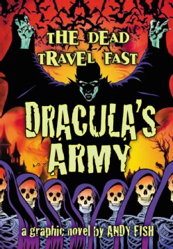 Title: DRACULA’S ARMY: THE DEAD TRAVEL FAST
Issue Number: Graphic Novel
Publisher: McFarland
www.mcfarlandpub.com (800) 253-2187
Creator: Adapted from Bram Stoker’s DRACULA
Adaptation by Andy Fish
Price: $17.99 (124 pages)
Release Date: NOW ON SALE
Genre: Horror Classic Adaptation
Occasionally I get to read and review a comic done by a local talent. They vary
in quality from amateurs doing this as a hobby to very professional productions
– and everywhere in between. Andy Fish has been a friend and patron of That’s
Entertainment for a long time and we still see him and the lovely Veronica from
time to time. So I was happy to see this item waiting for me to review. This is
one of the truest adaptations of the Stoker novel I have seen. Having read the
original years ago it is amazing how much of the story came back to me after so
long. Andy sticks to the style of that work relying heavily on the Journals of
Jonathan Harker and Mina as they played out in the original. A graphic novel
adaptation can bring so much more of the original work into it versus a movie or
TV adaptation. Andy hits all the high notes of the story by using more of the
novel in his script and of course the visual interpretations. There is enough
dialogue and description to really identify and flesh out the characters. He has
taken a unique approach to depict Count Dracula with skin that has a green hue
and features that more approximate the famous Nosferatu from the 1922 film. This
is not true to the Stoker novel but visually it gives the reader a better
perception of the evil character. The sequential art is very pleasing from panel
to panel. Andy has a good grasp of telling the story visually to compliment the
dialogue and narrative. This being a mostly dark story the shading and coloring
is critical to set the mood. Additionally the characters are all unique one from
the other. I really enjoyed this adaptation and as I have said place it high on
the list of works based on one of the true classic of horror literature. I am
not sure why the title is not just DRACULA but perhaps the intention is to draw
in readers who expect something different. Regardless it is an excellent graphic
novel well worth your time and money.
 Title: UNCANNY AVENGERS
Issue Number: 14
Title Story: The Day nor the Hour
Publisher: Marvel
Writer: Rick Remender
Artist: Steve McNiven
Inker: John Dell
Colors: Laura Martin
Letters: Clayton Cowles
Price (USD): $3.99
Release Date: NOW ON SALE
Genre: Super Hero
I picked up this issue because I read about the key plot element which may be
controversial among regular readers of the mutant books from Marvel. I won’t
spoil the ending for that reason. I have not been reading this series so I felt
this was a good issue to see where it has been going in the last year. This
first few pages are a mystery to the new reader as it depicts Kang hopping to
different places in time to gather a certain person for his master plan. These
are all future times and at each point he is essentially rescuing a new comrade
from the same world-ending event, some sort of disintegration of everything. The
time spans from 2014 to 3806 and includes people like Dr. Doom 2099, Stryfe, May
Parker Venom, Arno Stark, Ahab and Deathlok. Well, we can only guess at what
that is leading to as it is left for a later issue. But, we do get the recap
page that explains the twin heirs of Apocalypse, Uriel and Eimin, have been
doing their thing in the present and fractured the Uncanny Avengers. In the
times that followed Wonder Man, The Scarlet Witch and Wolverine were abducted by
the Four Horsemen of Death. Uriel and Eimin propose to the Scarlet Witch that
the war between man and mutant can end if she would use her powers to rapture
the entire mutant race to a new home world. While pretending to go along with
that plan Wanda reveals to Simon that she will actually summon all the mutants
to their location to fight the twins. Finally, unknown to Wanda, Rogue and
Sunfire know of the twins’ scheme, believe Wanda is complicit in it and plan to
stop her any way they can. So the first thing I take away from the beginning of
the book is the plot has been complex, lots of stuff has gone on before, and it
is building to a big climax. The balance of the comic, which is the majority of
the issue, deals with these three groups and their schemes as they clash. Some
are foiled, some are not and there will be death. As far as the execution (no
pun intended) of it all it reads well and the art is quite spectacular. It seems
like the kind of story you would expect from a book with these characters.
Frankly I am tired of the same old clichéd “death of major characters”. In
almost every instance, especially in the last decade or so, the dead person or
persons come back in a year or two. Think about Captain America, Batman and
Johnny Storm to name three. So will the deaths in this issue matter or last more
than a year or two? I seriously doubt it. Only time will tell.
 Title: LETTER 44
Publisher: Oni Press
Writer: Charles Soule
Artist: Alberto Jimenez Albuquerque
Colors: guy Major
Letters: Shawn DePasquale
Price (USD): $3.99
Release Date: NOW ON SALE
Genre: Science Fiction
I was intrigued enough by the first issue of this series and where it left us
that I needed to see what came next. The opening premise was that the newly
sworn in President of the United States received a letter from his predecessor
as is the tradition on the eve of his inauguration. In it he found out there is
an alien presence in the asteroid belt constructing something. The prior
president committed defense resources to not only getting ready if the aliens
proved hostile but also fund and launch an exploration craft with a small
contingent of scientists and military people to try to find out what is
happening in space. This is what we learned in the first issue as well as
getting to know the astronauts as they approached the critical point in their
mission. This second issue takes them past the edge of some sort of barrier that
could not be penetrated by scanners. Any unmanned probes sent past it failed to
transmit back through it. A good part of this issue deals with the near disaster
they encounter as they breach the barrier and how their determination gets them
past that problem. Meanwhile back on Earth the new president is getting up to
speed on some of the things that only a very few people at the very top level
ever knew about. There are weapons and systems that are so advanced it is
amazing that not only have they been kept secret but also could have drastically
shortened the wars of the last decade. But the most interesting part of this
issue are the opening pages as one of the secret scientists is briefing the
president and is asked the main question – what are the aliens building? His
immediate response is that to answer that question he must answer three others
first. Do they know we are here? Do they care that we are here? Do they want
something from us? His detailed discussion of each question leads to the next
and leads him back to the original question. He cannot actually say what it is
but it must be being built because the aliens want something. I found the
monologue intriguing and a good lead to the rest of the issue. I like the way
the plot is evolving slowly both on Earth and in space. The president is
learning a lot about what has gone before and is already forming plans on what
to do next. In space the crew is making progress, has bonded into more of a
family than just co-workers. One key fact is revealed about their mission that
sheds new light on their individual and collective character. I think this is a
fascinating story though I find the art a bit unappealing when it comes to the
depiction of the people. It takes a while to get used to because it is different
from what I am used to. You do not need to read the first issue to get the gist
of it all. So if you too are intrigued pick up this one and form your own
opinion.
 Title: THE FOX
Issue Number: 1 (of 5)
Title Story: Freak Magnet
Publisher: Red Circle/Archie
Writer: Dean Haspiel/Mark Waid
Artist: Dean Haspiel
Colors: Allen Passalaqua
Letters: John Workman
Cover Artist: Dean Haspiel/Darwyn Cooke/Fiona Staples
Price (USD): $2.99
Release Date: NOW ON SALE
Genre: Super Hero
Archie introduced its Red Circle line of hero comics during the Golden Age. The
Fox first appeared in 1940. Over the years they have been discontinued only to
be revitalized a decade or so later. We are in the latest cycle of Red Circle
heroes and so this five-issue mini-series is bringing back the Fox. The
character is Paul Patton Jr., a photo-journalist. He first took over the hero
identity in the 1984 series. The story goes that his father was the Fox before
him and then he retired. Paul decided he could become the Fox and lure criminals
for a chance to get flashy pictures that would advance his career, and make it
with the girls. But as he has found out over the years his hero identity has
been a magnet for more than just criminals but all kinds of freaky things. As
the story opens he has just moved back to his home city with his new wife and
son. He has matured some and now is more about getting the bad guy than
advancing his career. That does not seem to being all that well as the first few
pages have him tied up and being beaten. Next we back up in time and proceed
with the events that got him in this fix. Sure enough it involves another one of
those freaky occurrences. While interviewing the spokeswoman for a new social
network he is mesmerized by her stare. It turns out there is more to it than
physical beauty as he learns this gal is really Madam Satan hiding her real
appearance that is like a green skull. She has more than a hypnotic stare among
her powers and a quick change into his Fox identity begins the usual battle. If
that isn’t enough, after we find out why he was kidnapped and he manages to get
free of his bonds another new character materializes out of the blue and insists
he must come with her to save her husband. It’s going to be a long day. In the
backup story Paul goes shopping for a Polaroid camera at a pawn shop to educate
his son on the old school method of taking pictures. The camera indirectly gets
him involved with a shape shifting building and the Fox has to figure out what
is going on. I like the style of these stories as they have more of the style
of comics of decades ago. There is enough here to get interested in the
character though the basic action is normal super hero stuff. The art is very
dynamic and even the Fox costume has its own appeal. Overall I would rate it
better than average. If you are looking for a generic hero comic to appeal to
all ages this is a good fit.
 Title: THE MAXX: MAXXIMIZED
Issue Number: 1
Publisher: IDW
Creator: Sam Kieth
Story: Sam Kieth
Script: William Messner-Loebs
Artist: Sam Kieth
Additional Inks: Jim Sinclair
Colors: Ronda Pattison
Letters: Mike Heisler
Price (USD): $3.99
Release Date: NOW ON SALE
Genre: Hero/Fantasy
Old timers who might think that this title is somehow the new adventures of The
Maxx will be disappointed. Rather than a new series this is Sam Kieth’s original
series remastered. What that means is the original art was rescanned, recolored
and printed on better paper than the original. Those old timers who enjoyed the
series when it was first out may enjoy revisiting it in this newer format. For
the rest of you it is a chance to read one of the better series from an era that
seemed to focus more on the popularity of the creators than it did on the
quality of their work. That is not to take away from the skill or achievements
of the founders of Image Comics but for me THE MAXX was a more complex story
that pushed the boundaries away from the standard super hero and black op team
themes the others were putting out. It takes a while to get into what is really
happening in this book. The visuals shift from reality to fantasy with
characters from the real world crossing over to a fantasy world patterned after
the Australian Outback. There are nasty little creatures called the Isz that
look like little black balls with big feet, skinny arms and big sharp teeth. The
main character is actually a homeless man that lives in a box in an alley, Maxx.
At first you don’t realize he is a man as he is dressed in a yellow and purple
costume that is not easy to describe. He is the one with both mental and real
world problems. The opening scene is about some muggers who have attacked an
attractive lady and dragged her into the alley Maxx lived in. Maxx is stirred by
the commotion and comes to her rescue but something else is going on here as he
eventually ends up in the local precinct and once again his social worker is
called to bail him out. Julie is the other main character. She is a bit
unconventional in that she does not dress all that modestly for a public
servant. She is Maxx’s refuge and when he somehow (in dreams or whatever else is
happening) ends up in the outback world she is there too as a jungle queen that
rides a Leopard – the Leopard Queen. So the questions the first-time reader asks
is which world is real and which is the dream? Who is the mysterious man in the
flowing cape and bald head that controls the actions of the Isz? Are they real
or part of some imagined foe that Maxx has to contend with? As I said it is
complex but fascinating and visually stunning. The colors on the remastered
version are vibrant and really highlight the talent in the pencil and ink work.
THE MAXX was a big hit when it was first out and spawned (er, no pun intended)
its own MTV cartoon show. Its magic is sitting there on the rack waiting for a
new generation of readers to discover.
 Title: BLACK SCIENCE
Issue Number: 1
Publisher: Image
Writer: Rick Remender
Artist: Matteo Scalera
Painted Art: Dean White
Letters: Rus Wooton
Price (USD): $3.50
Release Date: NOW ON SALE
Genre: Science Fiction
The first issue of this science fiction thriller has the lead character trying
to escape from what is clearly another dimension or reality filled with
monstrous creatures. How he and his companion got there is slowly discussed in
the narrative text. The two are being pursued by humanoid warriors riding large
snake-like creatures. They are trying to find something to fix their dimension
hopping equipment where the rest of their party is waiting. But time is running
out. Before he makes it back Grant will have to escape these bad guys, avoid the
giant turtles swimming in the water and make his way into a pyramid shaped
temple. There are also some not so friendly giant toads that spew out electrical
charges with their tongues. This is a typical plot where the hero has gotten
into what appears to be unescapable predicaments one after the other and once he
reaches his goal that sequence will not stop. I was not overly entertained by
this comic. The art is decent enough though it is rough-lined in spots. It
moves the action and there is a lot of variety in what is called for in the
script. I am not all that excited about a story based on scientists stranded in
a strange world through their own errors. Among the group there is even an
obligatory complainer that you love to hate. Grant has two kids with him – who
does that? Clearly these folks did not take proper precautions or
experimentation before jumping into a very hostile environment. It just lacks
credibility as a premise. I like some of Remender’s work but I think I’ll pass
on this one.
*****
TRIVIA CONTEST!!!! WIN REAL PRIZES!!!!!
If you think you know the answer to the trivia question send your guess via
Email to me at ComicBkNet@aol.com and you could win the prize. The first six
correct answers will be assigned a number and a roll of the dice will determine
the winner. You should put your real name in your message so we know who you
are. Prizes must be claimed at our store within 30 days of winning. The prize
will be a $10 credit slip, which will be redeemable for merchandise at regular
retail or in-store ongoing specials only. Only one prize per person will be
allowed per every 4 weeks. I will be the sole judge of the correct answer even
if more than one answer could be correct. Submit only one answer per Email
please but guess as often as you like.
Last week’s trivia question:
By what name was Guy Gilden better known?
Guy Gilden was better known as GOLD of the METAL MEN. The winner by the dice is
David McBarron.
THIS WEEK’S TRIVIA QUESTION:
In HULK: FUTURE IMPERFECT there is a pile of bricks with one green one on top in
Rick's trophy room. Where did the pile come from and what is the green one?
Folks, you never know who among the readers is knowledgeable about the question
so don’t hesitate to send in an answer – even days after it appears.
No comments:
Post a Comment